
You spent hundreds of dollars on a high-quality print, a custom stand, and a sharp design. Yet, when you look at your booth at a trade show or in your store, the banner stands silent. People walk right past it. It isn’t generating the leads you expected, and you are left wondering why your roll up banner isn’t getting leads.
This is a common frustration for many businesses. A banner is a powerful tool, but it often fails because of tiny mistakes in how it is designed, placed, or used. If your banner sits in the corner as a piece of background noise rather than an active member of your sales team, you are losing money. This article will help you diagnose the issues so you can fix them.
Design Failures: The Split-Second Attention Crisis
At a busy trade show, you have roughly three seconds to grab someone’s attention. If your banner does not do that, the visitor keeps walking. Design is the first barrier to entry for your potential leads.
Overwhelming the Viewer with Text Density
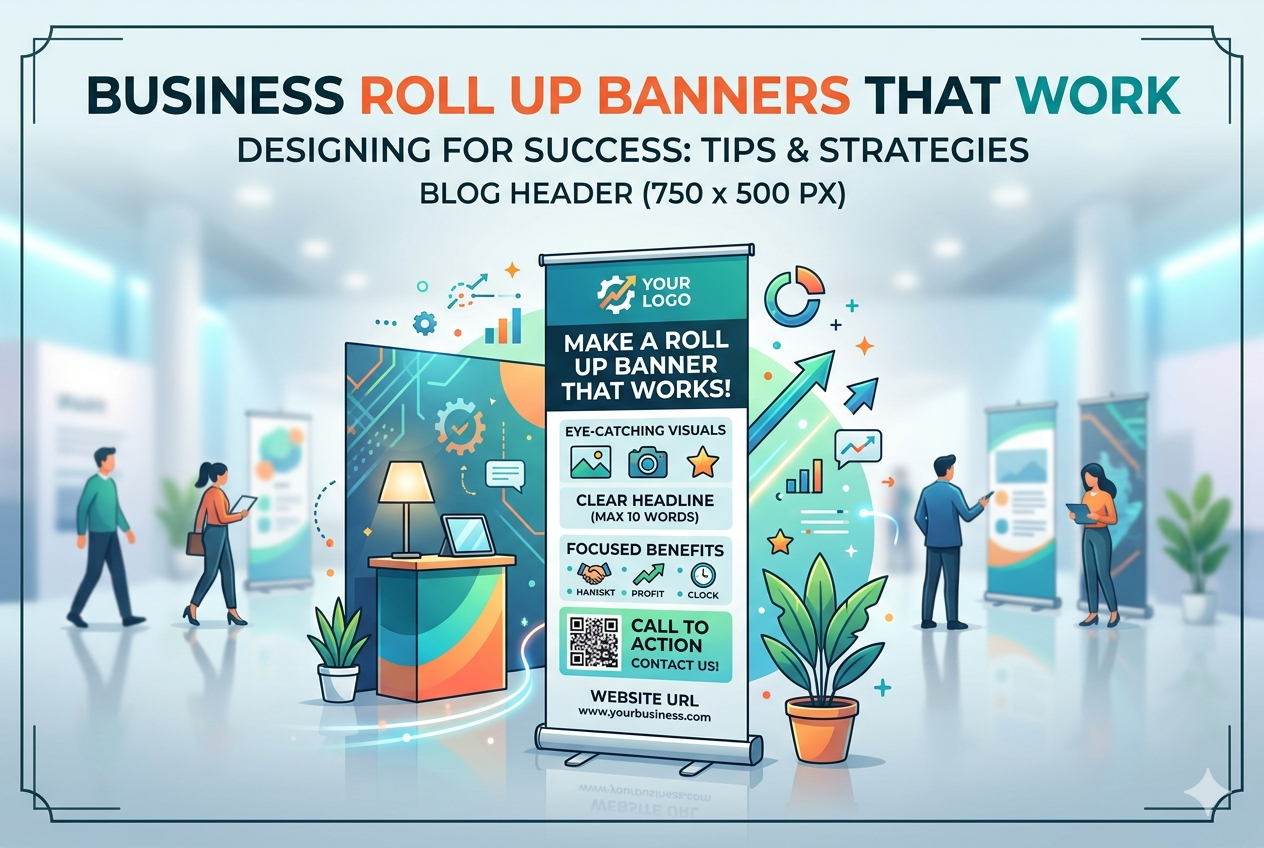
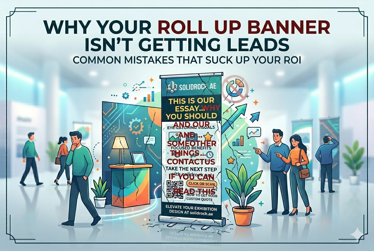
Paragraphs of text on a banner are a death sentence for engagement. People do not stand in an aisle to read your company history or a list of five different services. They scan. If they see a wall of text, their brain classifies it as “too much work” and moves on immediately.
To fix this, apply the rule of thirds to your layout. Keep your headline large and placed in the top third of the banner. Use bullet points for your core value proposition in the middle. Leave plenty of empty, white space to let the eyes rest.
Weak or Non-Existent Value Proposition
A banner that only says what you do is boring. “We offer IT solutions” tells a visitor nothing about why they should care. You need to focus on what the customer gains by choosing you.
Compare these two approaches. A generic banner says, “We offer IT solutions.” A benefit-driven banner says, “Cut Operational Costs by 30% with Our Cloud Integration.” The second one creates a hook because it solves a problem immediately. Tell them exactly how their life gets better.
Choosing Aesthetics Over Clarity
You might love a certain font or a background image, but does it serve the goal of getting a lead? Complex graphics, low-contrast text, or images that look stretched out cheapen your brand. They make you look unprofessional.
High contrast is essential. Use dark text on a light background or white text on a dark, solid background. Keep fonts clean and easy to read from ten feet away. If your design is pretty but unreadable, it fails.
Messaging Misalignment: Why Your Roll Up Banner Isn’t Getting Leads
Design is only half the battle. Your message must connect with the people actually walking in front of your display. If you are talking to the wrong crowd, your results will suffer.
Ignoring Your Target Persona at the Event
You cannot use the same banner for every event. If you attend a manufacturing expo, your banner needs to talk about machine uptime and production efficiency. If you take that same banner to a finance conference, it will fall flat. Tailor your message to the specific audience at each location.
Jargon Overload and Industry Buzzwords
Specialized industry language makes you sound smart to your peers, but it alienates your prospects. Your potential leads might be decision-makers who do not know the fine technical details. When you use too many buzzwords, you force them to guess what you actually do.
Test your headline on someone outside your industry. If they cannot explain what you do in five seconds, it is too complex. Strip out the jargon and use plain, clear language.
The Missing “Next Step” – Ambiguous Call to Action (CTA)
A banner without a clear call to action is just a poster. “Learn more” is not a call to action; it is a suggestion. You need a specific, urgent, and high-value next step.
Make it easy and enticing. Use phrases like “Scan for Free Audit” or “Book a 10-Min Demo Here.” Tell them exactly what to do and what they get for doing it.
Deployment Disasters: Placement and Presentation Pitfalls
Even a perfectly designed banner will fail if it is in the wrong place. You have to fight for attention on a crowded floor.
Poor Strategic Location and Flow Interruption
Is your banner blocking a main walkway? If it is, attendees will avoid your booth to keep moving. Is it tucked behind a pillar or a table? If it is hidden, it does not exist.
Place your banner near the edge of your booth, where it faces the natural flow of foot traffic. It should act as a signpost that invites people to come closer, not as a barricade that forces them to divert.
Inadequate Lighting or Contextual Clutter
Lighting changes everything. If the overhead lights wash out your banner, or if it sits in a dark corner, the colors will look dull and the text will be hard to read. You might even consider bringing your own small LED clip-on lights to make your display pop. If your competitors have brighter, cleaner displays, you will be ignored.
Staff Inaction: The Passive Banner Problem
The biggest mistake is thinking the banner does all the work. The banner is just a conversation starter for your staff. If your team sits behind a table looking at their phones while a visitor reads the banner, you have failed.
Train your booth staff to watch for people who stop to read the banner. That is the opening cue. They should be ready to step out, smile, and ask a question based on what the person was reading. The banner is not a salesperson replacement; it is a tool for your team to start a relationship.
The Broken Funnel: Why Your Roll Up Banner Isn’t Getting Leads
If you do not have a way to track the interaction, you will never know if your banner is working. Many businesses treat banners as branding exercises, but they should be lead generation machines.
The Absence of Scannable Technology
Stop relying on business cards to capture leads. It is slow and prone to errors. Integrate technology directly onto the banner.
Use a large, high-contrast QR code that takes the user to a specific landing page. If you are struggling with your content strategy, some 21 common blogging mistakes can apply here, like failing to provide a clear path forward for the reader. Make sure your landing page is mobile-friendly and fast to load.
The Unappealing Lead Magnet
If you promise a download, it has to be worth their time. A generic brochure is not enough to get someone to scan a code. Offer something specific. A “checklist for X,” a “template for Y,” or a “special report on Z” works far better than a general sales pitch.
Failing to Track Banner Performance
How do you know if your banner generates leads? If you use a general URL, you cannot track it. You need a dedicated, unique landing page for that specific banner. Use a tracking link that allows you to see how many people visited that page from the event. If you don’t track the data, you can’t improve the results.
Conclusion
Your roll-up banner has one job: to stop people in their tracks and get them interested enough to provide their contact information. If it isn’t getting leads, it is likely because the design is too busy, the message is unclear, the placement is poor, or the tracking is non-existent.
Clarity always beats creativity. If people don’t understand what you offer and what they should do next, you have wasted your investment. Before your next event, run a full audit. Look at your banner from ten feet away. If the headline is blurry or the call to action is missing, change it. Make your banner work for your business.
Don’t let your next exhibition pass you by. Partner with Solid Rock to design and print high-quality, impactful banners that capture attention and drive results.
Contact Solid Rock at solidrock.ae for your custom quote today!